

SPUR
Duration
10 Weeks
Role
UX Researcher
UI Designer
Service Designer
Team
Tanishq Kalra
Ting Lyu
Shruti VR
Description
In our Theory of Interaction Design class, we were assigned to investigate current travel industry trends and develop an application based on one of these trends. We discovered a trend indicating a preference for spontaneous travel, inspiring the creation of SPUR.

The Problem
Trend

According to research published in a recent Google blog post, the market for travel-related impulsive buying is untapped and has significant growth potential. According to the survey that Google and Phocuswright did, more than 60% of American tourists would consider an impulsive vacation based on a good hotel or airline offer.
Problem
Due to the shortage of time, users do not have time to prepare their travel plans, expenses, etc. And because of the lack of preparation, there are often unexpected situations along the way.
How might we utilize data and technology to let people take impulsive trips without being worried about it?

DiscoverPrototypeSecondary Research
HMW Statement
Empathy Map
Customer Journey Map
Rapid prototype
AnalysePrototype
Usability testing
Movie
Final Prototype
Poster
Methodology
DeliverBusiness Model Canvas
Wireframes
Concept Testing

Discovery
Empathy Map
Customer Journey Map
The user's journey is shown on the map as he plans or organizes a trip for himself or his friends and family. Additionally, the map displays his needs, pain, touchpoints, and other actions he takes during his booking journey.

Empathy Goal

I would like to go on an impulsive trip, but after considering all of my options, I'm feeling overwhelmed and indecisive. I'm willing to take a chance and let someone else plan a surprise trip for me based on the information I've provided ahead of time.

Planning a trip for themselves.

We searched for emerging travel industry trends as well as new technological developments during our secondary research on the subject.

Planning a trip for others.


Key Insights
Reducing the touchpoints
Finding the best prices for events, and hotels, and arranging an entire itinerary may be difficult for users who fear missing out on new and exciting experiences.
Expectations are not met
The user is frustrated and wants a trip planned for them or for the person they are organizing the trip for based on their preferences and schedule.
High points of friction
Before choosing where and when to travel, a user must consult forums, reviews, travel vlogs, and videos. To arrange a vacation, they must go through a number of hoops and collect ideas and recommendations from others.


Crazy 8’s
Rapid Prototyping
We utilized the Crazy 8s exercise for rapid prototyping, prompting us to quickly outline the user journey steps and draft low-fidelity wireframes for the application. This exercise provided valuable clarity on the application's envisioned appearance and the features we intended to incorporate.


Business Model Canvas


The team used the Business Model Canvas to map out their vision. This tool helps brainstorm key aspects of the business, like how SPUR delivers value to users and generates revenue. By visualizing these components, the team was able to identify strengths, weaknesses, and areas for improvement, ensuring everyone is aligned on how to bring SPUR to life.
Prototype
Key Insights
Strategic Management
The Business Model Canvas helped us clearly define and communicate our business idea rapidly.
Business Implementation
It enabled us to understand our business and walk through the process of connecting the concept with the ideal method for implementing it as a business. As well as knowing our Unique Selling Point (USP).
Target Audience
Once the canvas was created, it became clear who to target as our users and how to acquire them by defining the various channels of communication.
Clear Grasp
We have a clear understanding of where we want to invest our money, what our revenue streams could be, value proposition, and insights on how to structure the costing.
Lo-Fidelity Wireframes


For our mobile application, we created Lo-Fidelity wireframes to enable users to better visualize the concept and provide feedback on what is working, what might be improved, and what could be added.

1
4
4 out of 5 users want someone else to book a trip for them.
The majority of users like planning, but they are unable to do it in a way that takes their interests into account while remaining within their budget.
2
5
Key Learnings
Users want to at least take one trip every quarter.
Before booking a trip, users would like to read reviews left by other users who have already taken a trip via the Spur mobile application.
3
6
According to our study, Gen Z and millennials prefer to go on impromptu vacations rather than preparing ahead and dealing with the problems that go along with it.
Some users are hesitant to use the application because they fear that it will propose locations they have already visited.


Usability Testing Findings
Select Preferences
Add brief text descriptions where necessary.
Add the option to select the number of travelers.

Copywriting
Make the copy style consistent across pages to maintain a light and fun atmosphere.
Be more specific in the content to better guide users.
In our usability testing sessions, participants were provided with scenarios and tasks to complete using the low-fidelity app, allowing us to evaluate its functionality and user experience.
Log In
Add the option to log in with other social network accounts.
Camera Page
Fill the entire screen with the camera, just like the camera app on the phone.
Briefly mention the intention of asking users to take photos in the copy.
Analyse
Setting Budget
A reference value for the budget is first displayed according to the user's situation, and then freely adjusted by the user.
Display of Items
Bring forward the item list from the second level to the first level, i.e., users can see what they need to bring without any action when they enter the page.

High-Fidelity Wireframes
Branding

Font Style
Following the creation of low-fidelity wireframes and usability testing, we advanced to crafting high-fidelity wireframes, incorporating our app theme and visual design elements.
Colour Palette
Onboarding
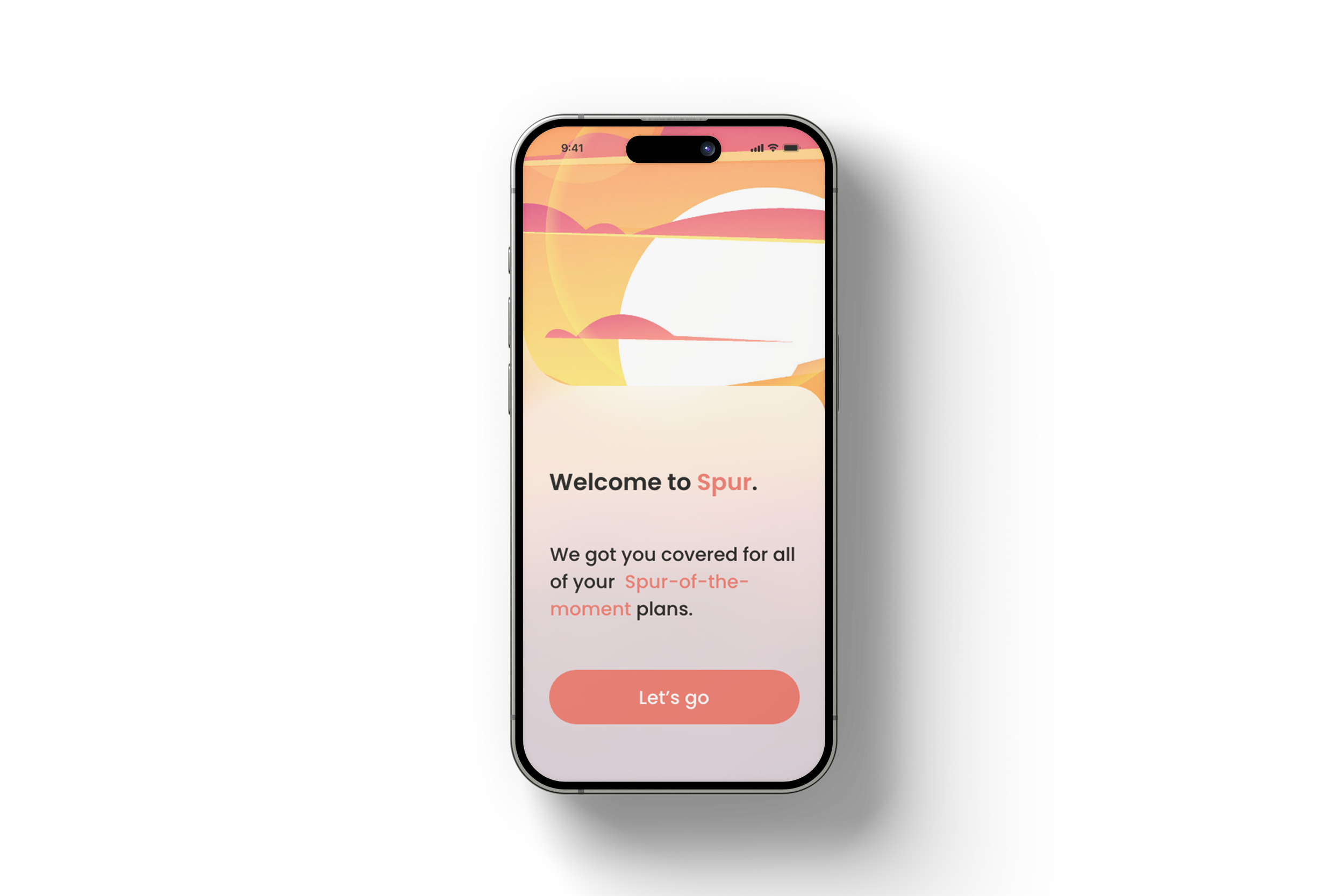
The user will first see an onboarding screen before being directed to the login page. The theme of the app will reflect this right from the start.


The user will first see an onboarding screen before being directed to the login page. The theme of the app will reflect this right from the start.
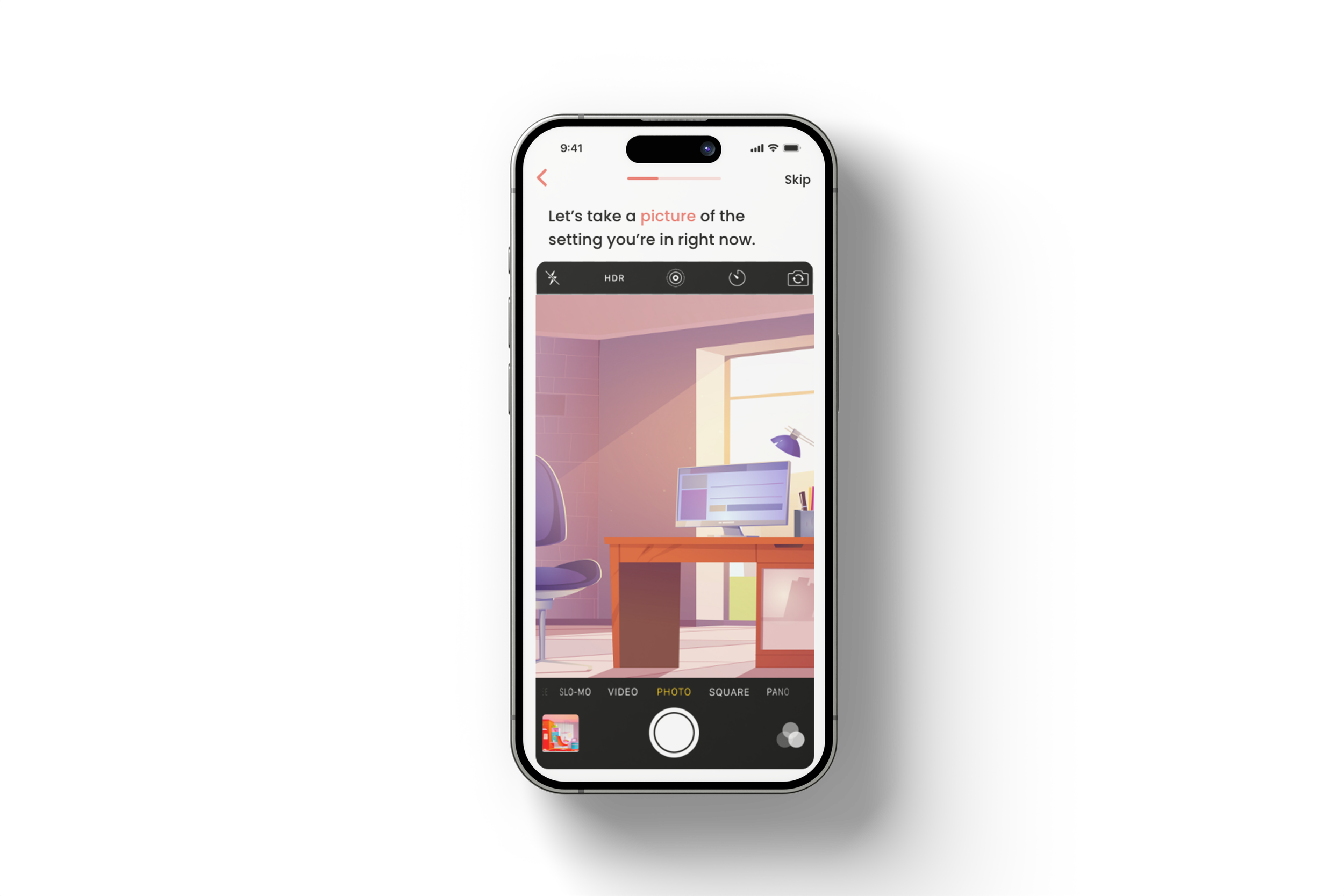
On this screen, the user will be prompted to take a picture of themselves or of their present environment. We want to make them aware of where they are in their lives.


Homepage
The user should swipe right/left on the prompt cards that will appear on the screen. This would help us collect data about their preferences.
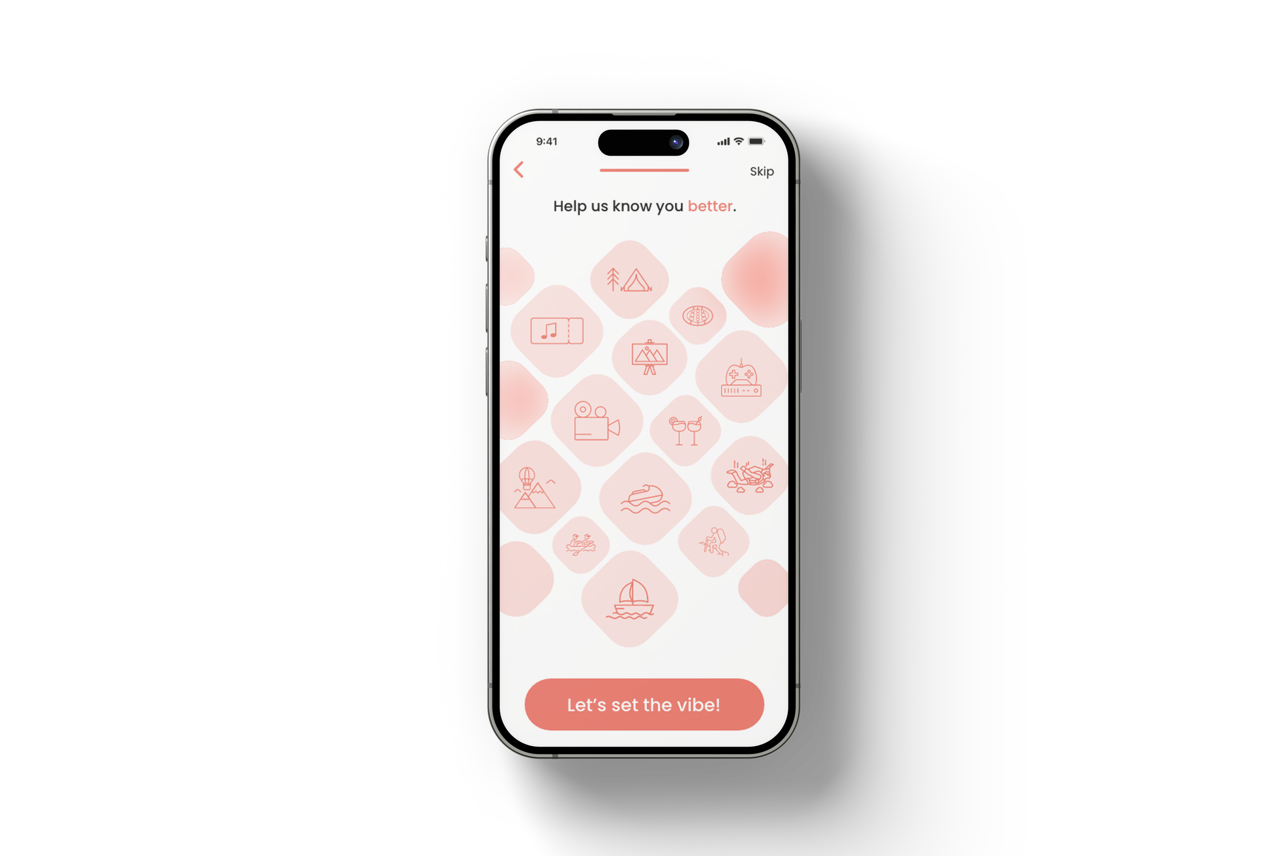
Quiz 1.0
The user should select the tile cards that will appear on the screen that best describe them. This would help us collect data about their preferences.

The homepage of the app is where users may choose their hotel, airfare, and experiences, or click the "surprise me" button to go on an unexpected vacation! To improve the algorithm, the user may also choose whether they like or dislike the different prompts.


In response to user feedback, we modified the app and added a few extra screens to improve the user experience. They can now choose between "International" and "Domestic" travel and adjust filters like "Adults", "Children" and "Rooms".

Filters

Budgetting
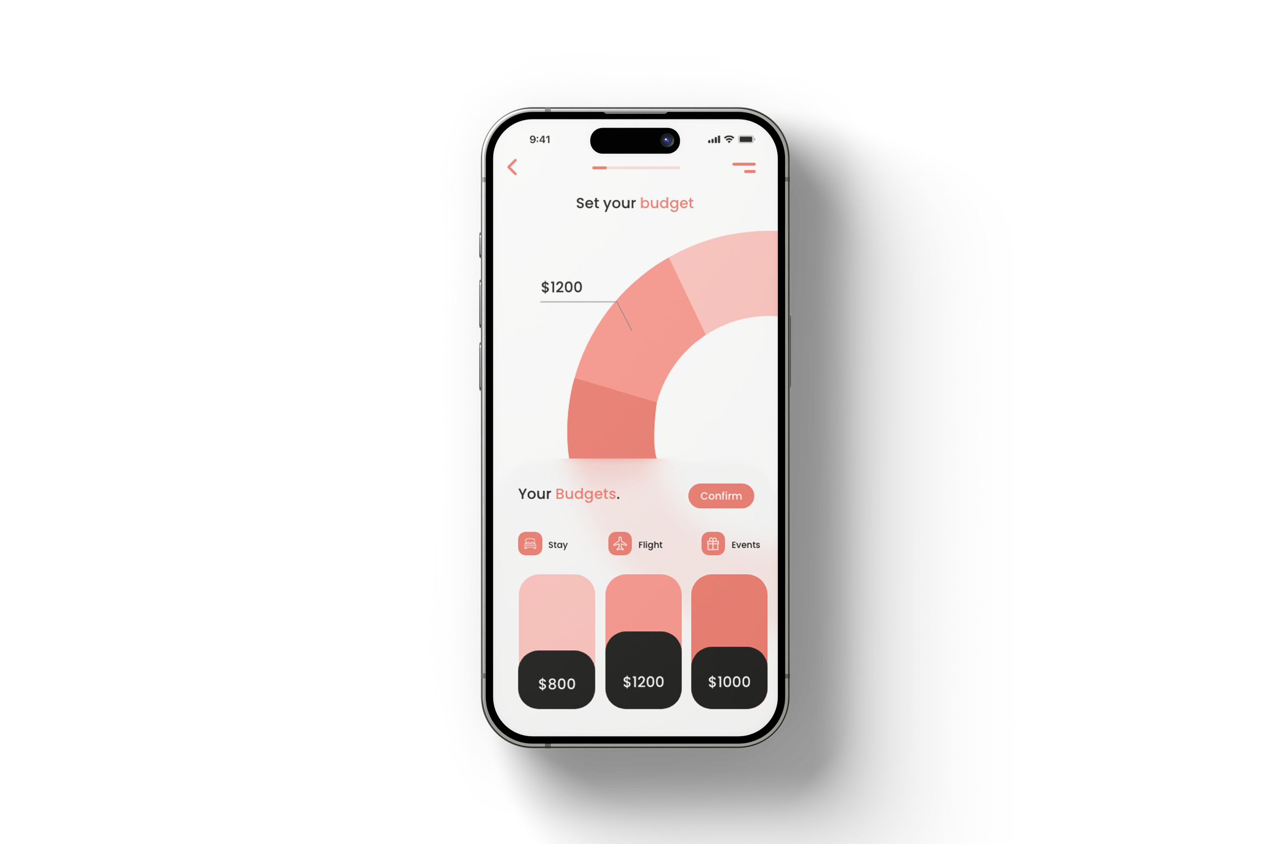
The user can set the budget based on their needs for "Flights", "Hotels" and "Events
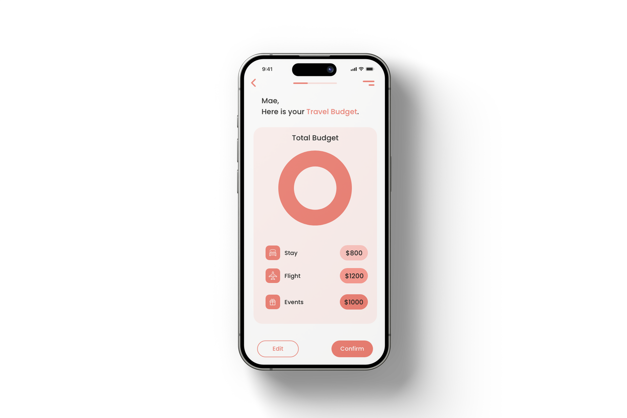
The user can see a consolidated list of the budget they have set and can edit or confirm it.


The user will be taken to another quiz, which will have more detailed and extensive questions and prompts. This would help us prepare a better itinerary and experience for the user before their final trip.
Quiz 2.0
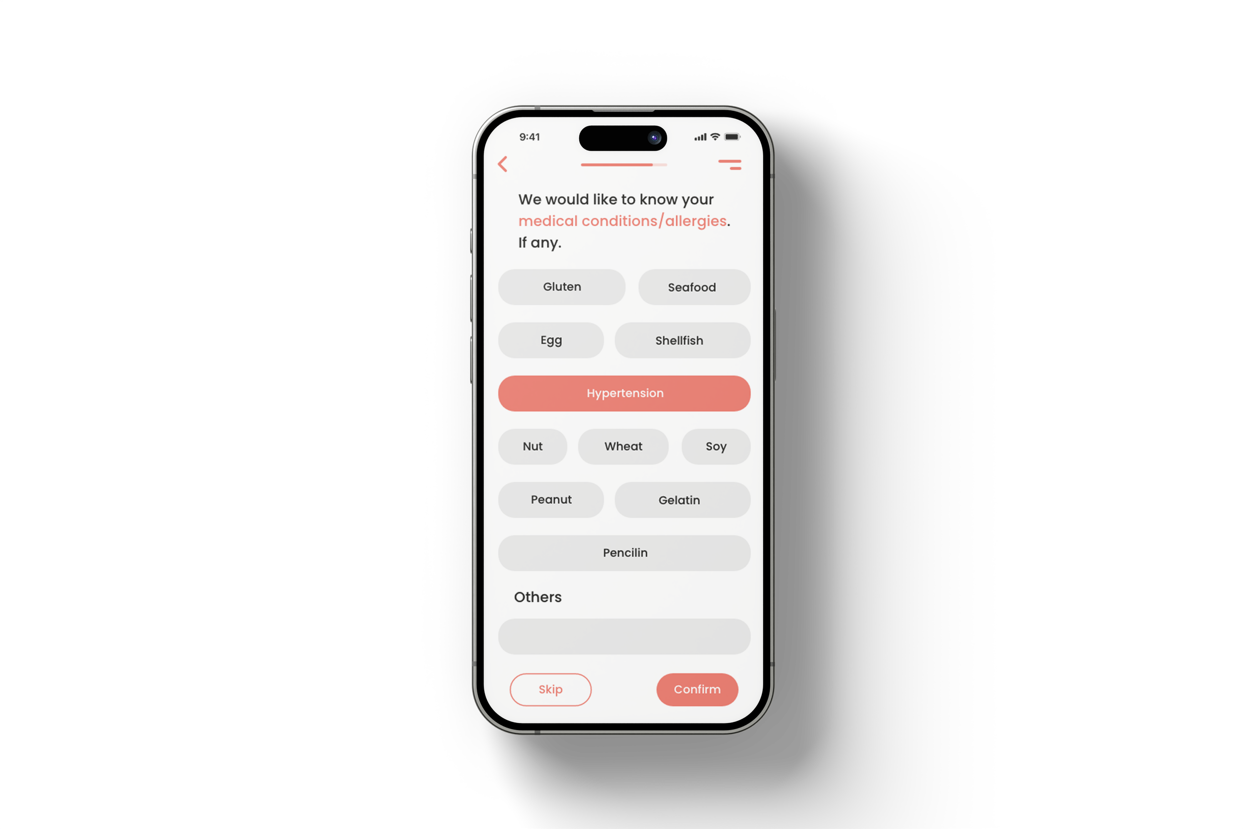
The user needs to select or provide any allergies or medical conditions they have. These details are important for the trip and could potentially affect it if not disclosed beforehand.


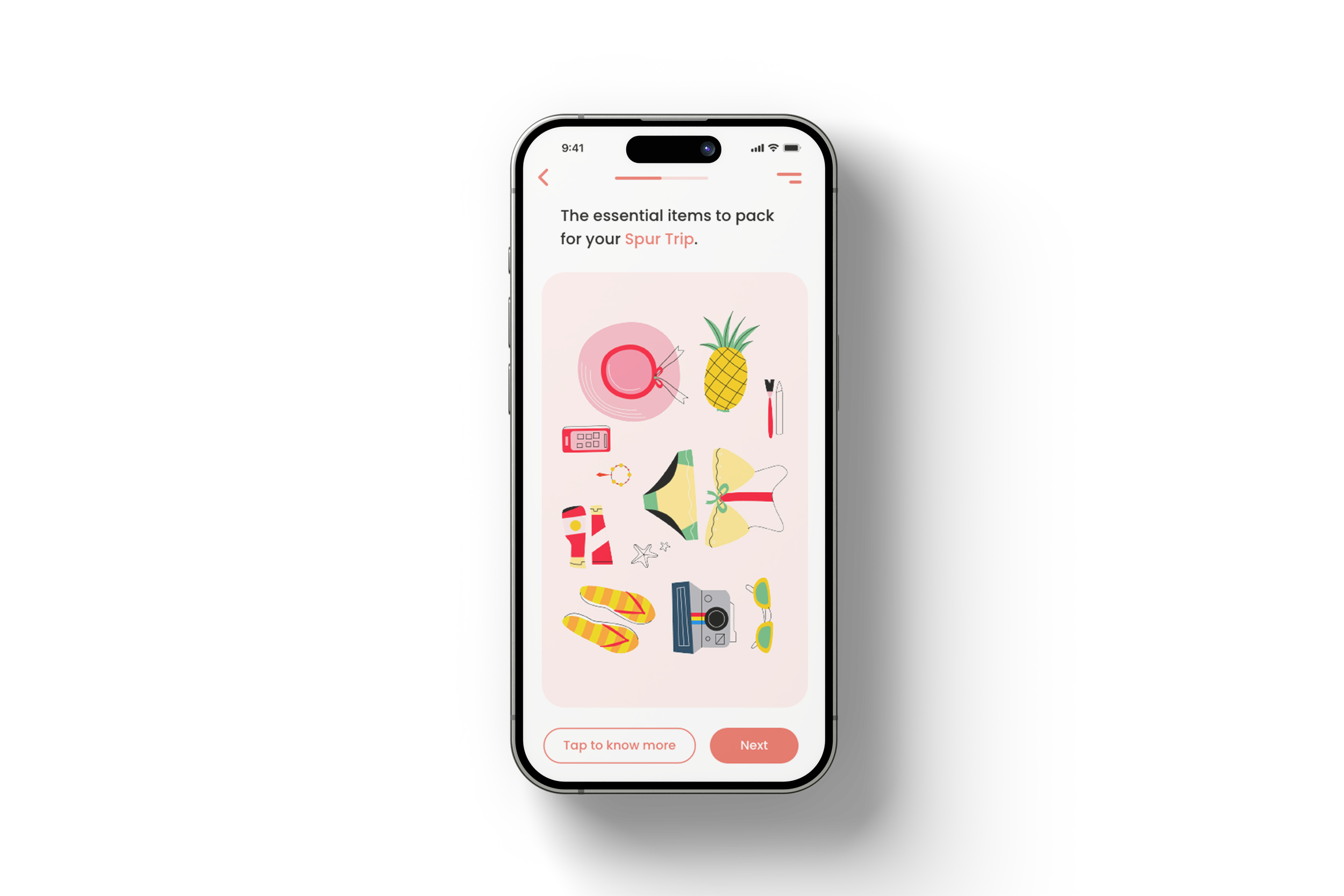
The user will get a brief idea of what they need to prepare and carry for their surprise trip. They can also read more about it and ask for help if needed.


Filters

(SPUR)-ise!

The user will then be brought to a screen with a gift box and a timer. This indicates how much longer they have to wait for their itinerary to arrive and the trip to begin.

Hooray! The user can now begin their travels!

UX Analytic H.E.A.R.T Framework

Deliver
We employed the HEART framework to assess SPUR, focusing on five key user-centered metrics: Happiness, Engagement, Adoption, Retention, & Task Success. We also created an advertising video for the application.


SPUR Video

Thank you!